ADACAP - UX Case Study - UI Design

ADACAP - UX Case Study - UI Design

Industry

Industry

FinTech

FinTech

Client

Client

Userdata

Userdata

Service

Service

UIUX Design

UIUX Design

Date

Date

2024

2024

ADACAP UX case study title slide: FinTech UI design project for client Userdata, 2024

Overview

Overview

ADACAP is a personal financial management platform designed to help users track income, expenses, assets, liabilities and tax obligations in one unified dashboard. The platform transforms raw financial transactions into meaningful insights, enabling users to understand spending patterns, optimize tax strategies, and evaluate overall financial health.

ADACAP is a personal financial management platform designed to help users track income, expenses, assets, liabilities and tax obligations in one unified dashboard. The platform transforms raw financial transactions into meaningful insights, enabling users to understand spending patterns, optimize tax strategies, and evaluate overall financial health.

Responsibilities

Responsibilities

  • Product Strategy & UX Architecture

  • End-to-End UI/UX Design

  • Dashboard Layout & Visual Data Representation

  • Component Library & Design System

  • User Journey & Information Architecture

  • Usability Testing & Iteration

Project Duration

Project Duration

2023

2023

2023

Project Goals

Project Goals

  • Design a dashboard that provides a high-level financial overview while allowing drill-down into detailed transactions.

  • Create a clean visualization system for income, expenses, assets, liabilities, and tax reporting.

  • Improve user clarity when verifying financial statements against bank records.

  • Support advanced financial decision-making with analytics such as projections, capital ratio, and exemption breakdowns.

Our Process

Our Process

  1. Discovery & Requirement Alignment Defined financial tracking workflows and user reporting needs.

  1. User Research & Persona Development Conducted interviews and analyzed behavioral patterns.

  1. Wireframing & Low-Fidelity Exploration Mapped user journeys and early dashboard layouts.

  1. Visual UI Design & Design System Built component library, typography, color tokens, and chart styles.

  1. Prototyping & Usability Testing Tested comprehension, readability, navigation ease, and interaction behavior.

  1. Final Design & Handoff Delivered responsive final designs with documentation.

Hand tapping a tablet showing the ADACAP Income Insights dashboard in a dim setting

User Research: Summary

User Research: Summary

Research consisted of interviews with financially active users including high-income professionals, business owners, and individuals managing multiple bank accounts or investments. Key findings highlighted frustration with fragmented financial sources, difficulty validating transactions, and limited visibility into real spending impact.

Research consisted of interviews with financially active users including high-income professionals, business owners, and individuals managing multiple bank accounts or investments. Key findings highlighted frustration with fragmented financial sources, difficulty validating transactions, and limited visibility into real spending impact.

Research consisted of interviews with financially active users including high-income professionals, business owners, and individuals managing multiple bank accounts or investments. Key findings highlighted frustration with fragmented financial sources, difficulty validating transactions, and limited visibility into real spending impact.

Research Goals

Research Goals

  • Understand how users currently monitor spending and investments.

  • Identify pain points in reconciling digital banking transactions.

  • Evaluate how users define “financial clarity” and “control.”

  • Determine metrics users rely on for long-term planning.

Product Users

Product Users

  • High-income professionals with multiple financial sources.

  • Investors managing assets & liabilities.

  • Small business owners.

  • Users who rely heavily on multiple bank cards.

  • Budget-aware individuals who want transparent spending tracking.
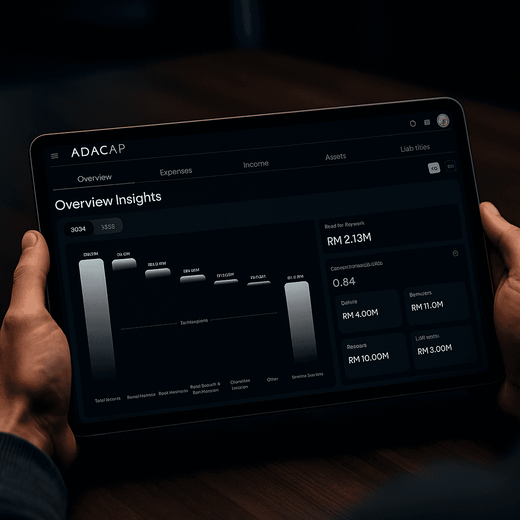
Hands holding a tablet displaying the ADACAP Overview Insights financial dashboard

User Needs

User Needs

  • A unified platform to track all financial categories in one place.

  • Clear breakdown of expenses by category and month.

  • Ability to verify transactions directly with bank statements.

  • Insights on tax obligations and exemptions.

  • Visual summaries instead of raw spreadsheets.

  • Accuracy and trustworthiness of data sources.

Our Persona

Our Persona

Smiling man in traditional Malay attire with songkok seated on a wooden chair
Daniel Rahman

Age: 42

Education: Master’s Degree in Finance from the University of Malaya

Location: Kuala Lumpur, Malaysia

Job: Senior Consultant & Investor

Family: Married with two children

User Pain Points

User Pain Points

  • Financial information is fragmented across multiple banks and platforms.

  • Hard to verify and reconcile transactions without manual effort.

  • Existing apps lack advanced insights, forecasting, and analytics.

  • Expense categories are often inaccurate, affecting budgeting clarity.

  • Limited visibility into tax impact and exemptions.

  • Visualizations are basic and don’t support deeper decision-making.

  • No unified dashboard combining income, expenses, assets, liabilities, and tax data.

Hands holding a tablet showing the ADACAP Stock Dividend income transaction list

Hi-Fi

Hi-Fi

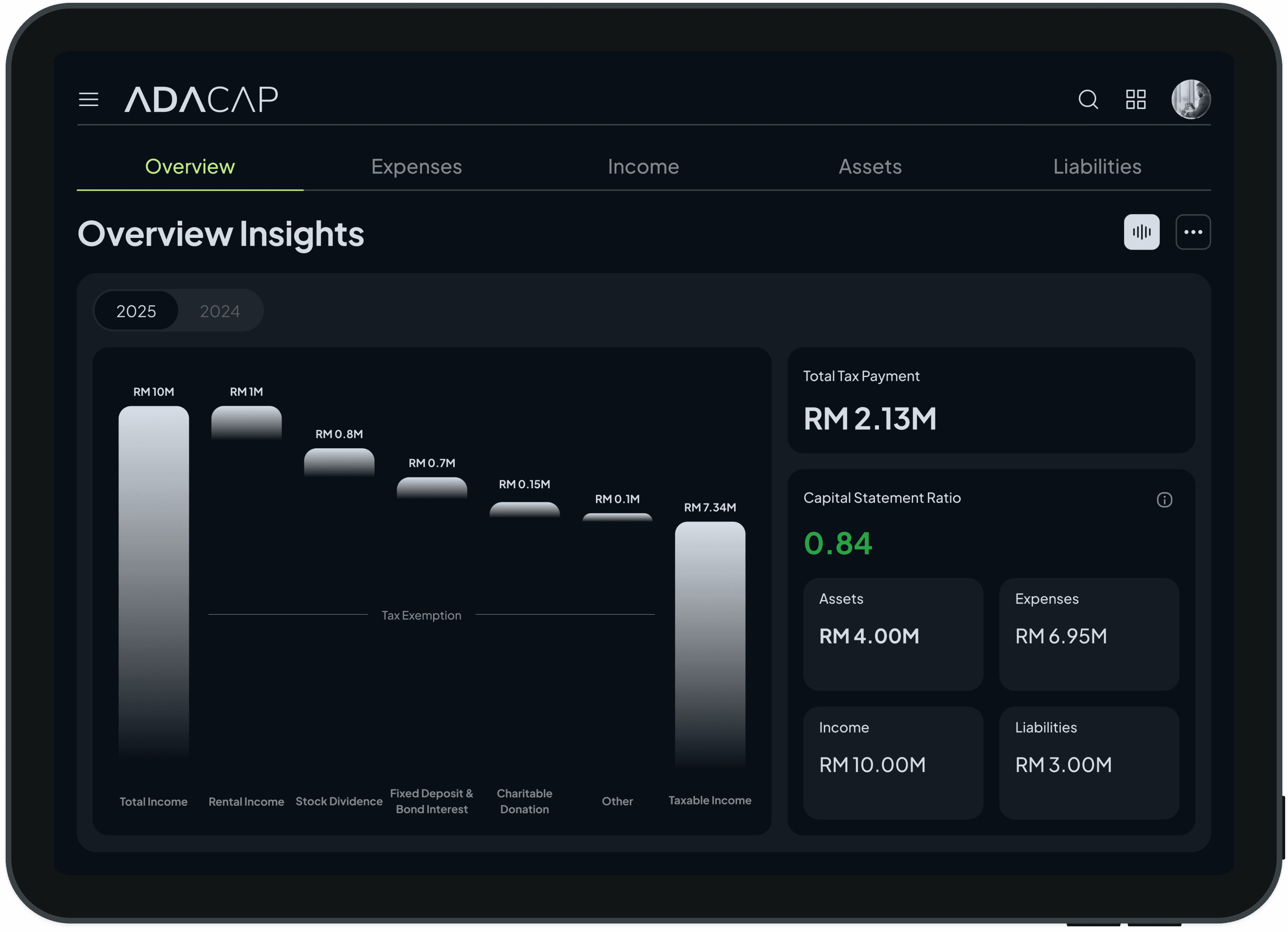
ADACAP Overview Insights dashboard with income waterfall chart, tax payment and capital ratio 0.84
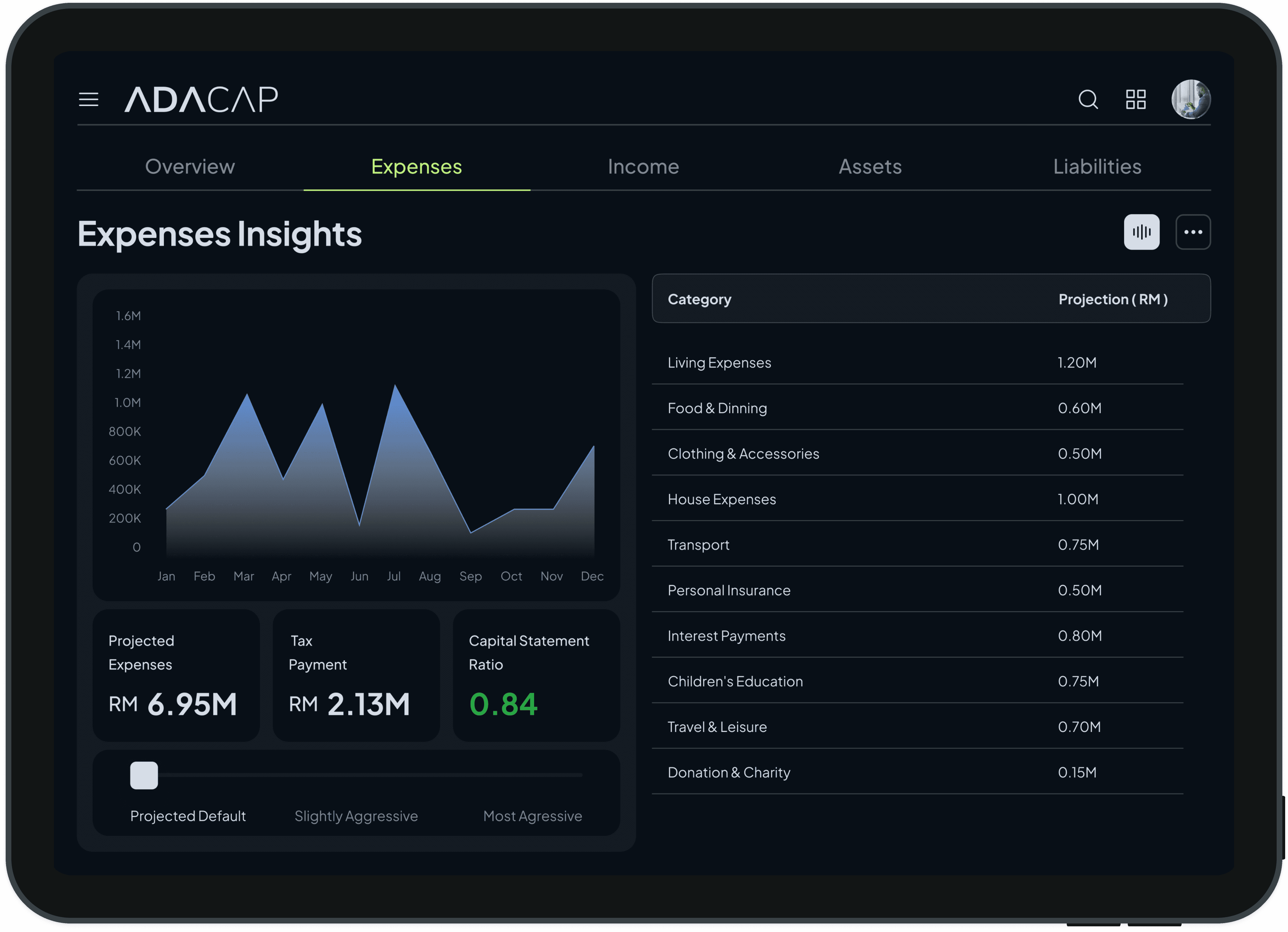
ADACAP Expenses Insights dashboard with monthly area chart and expense category projection table
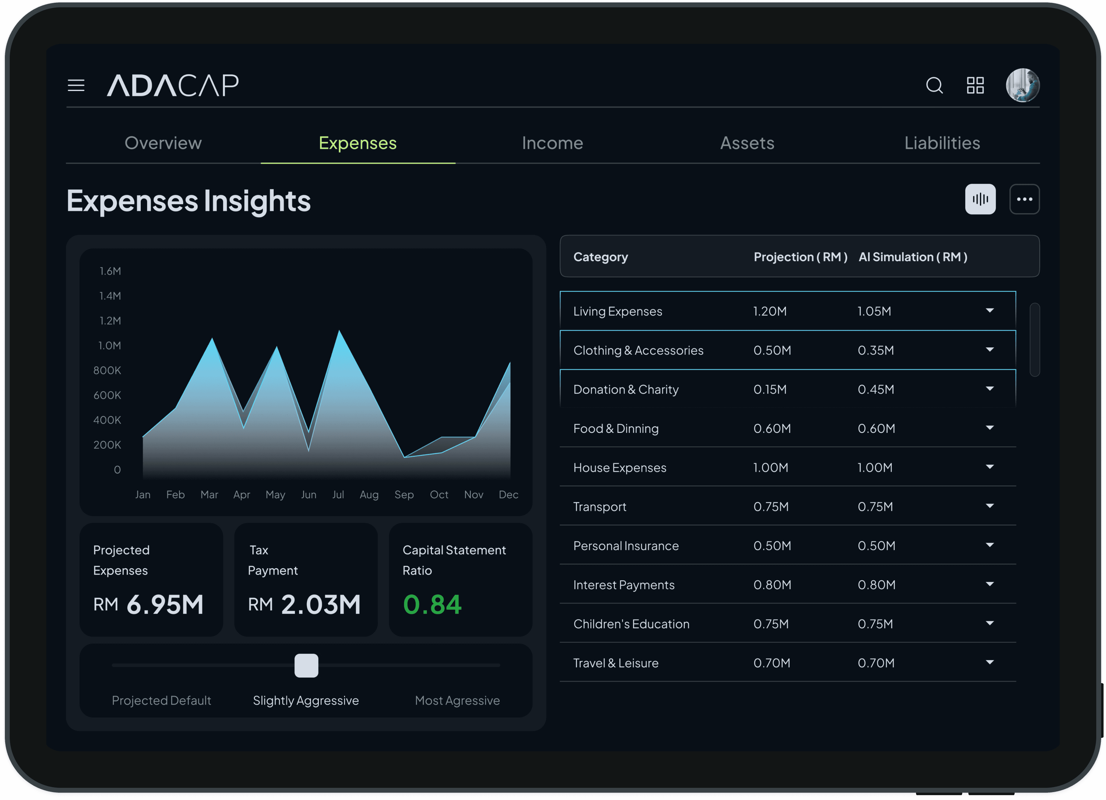
ADACAP Expenses Insights with slightly aggressive AI simulation comparing projected vs simulated spend
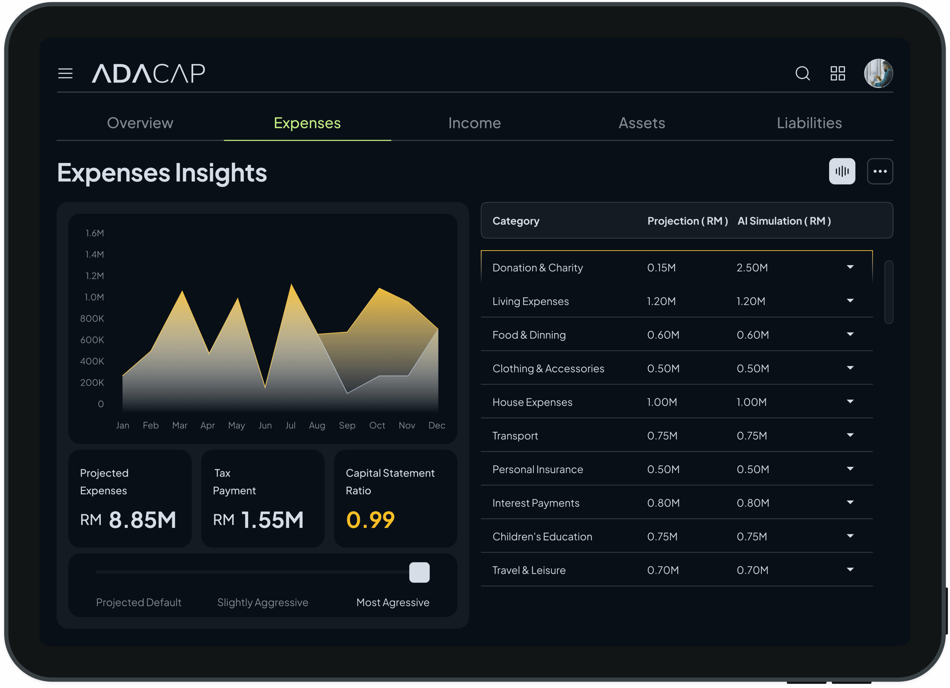
ADACAP Expenses Insights showing most aggressive AI simulation with capital ratio 0.99 in amber
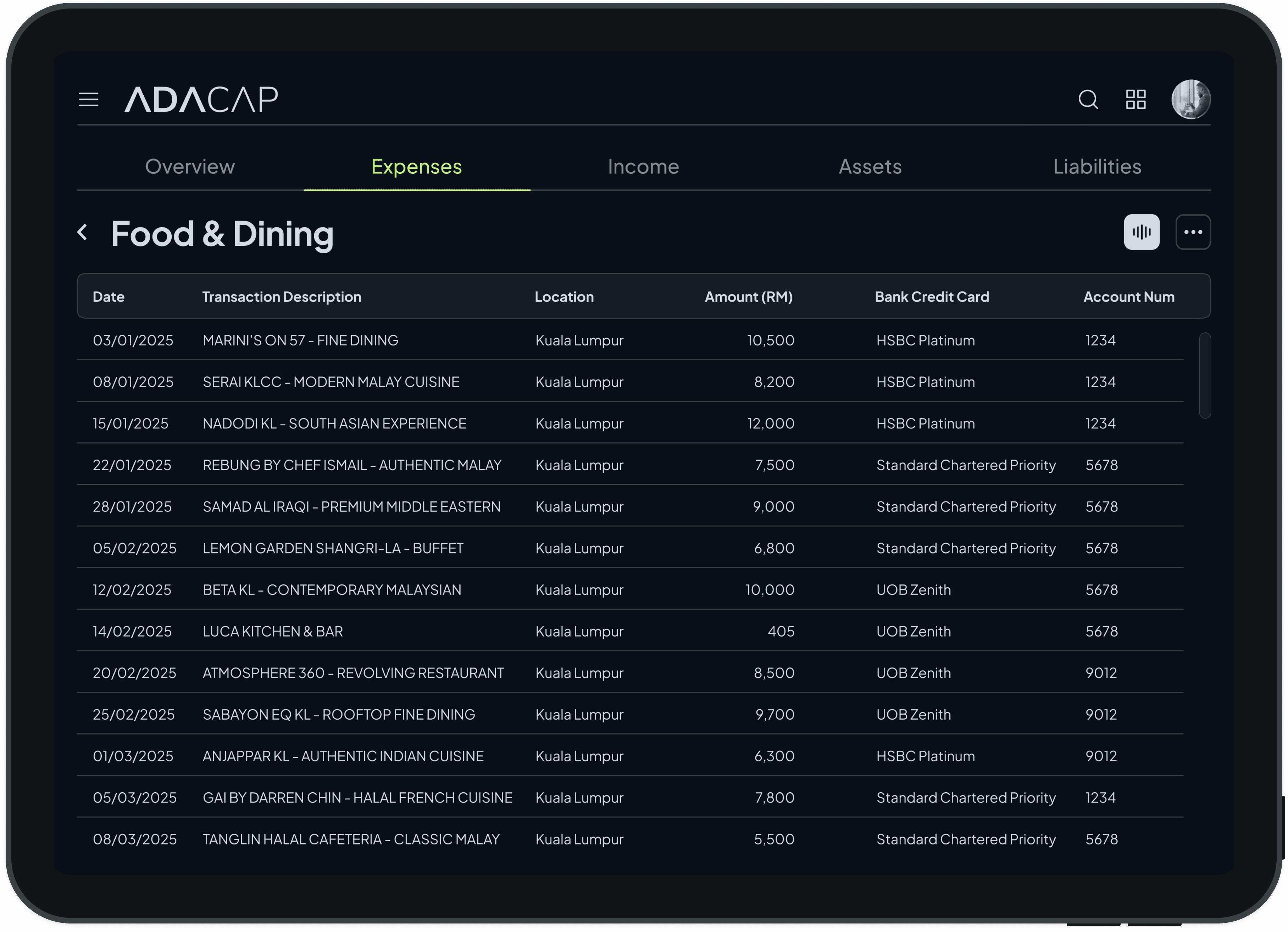
ADACAP Food and Dining expenses table listing dining transactions, amounts and bank cards in Kuala Lumpur
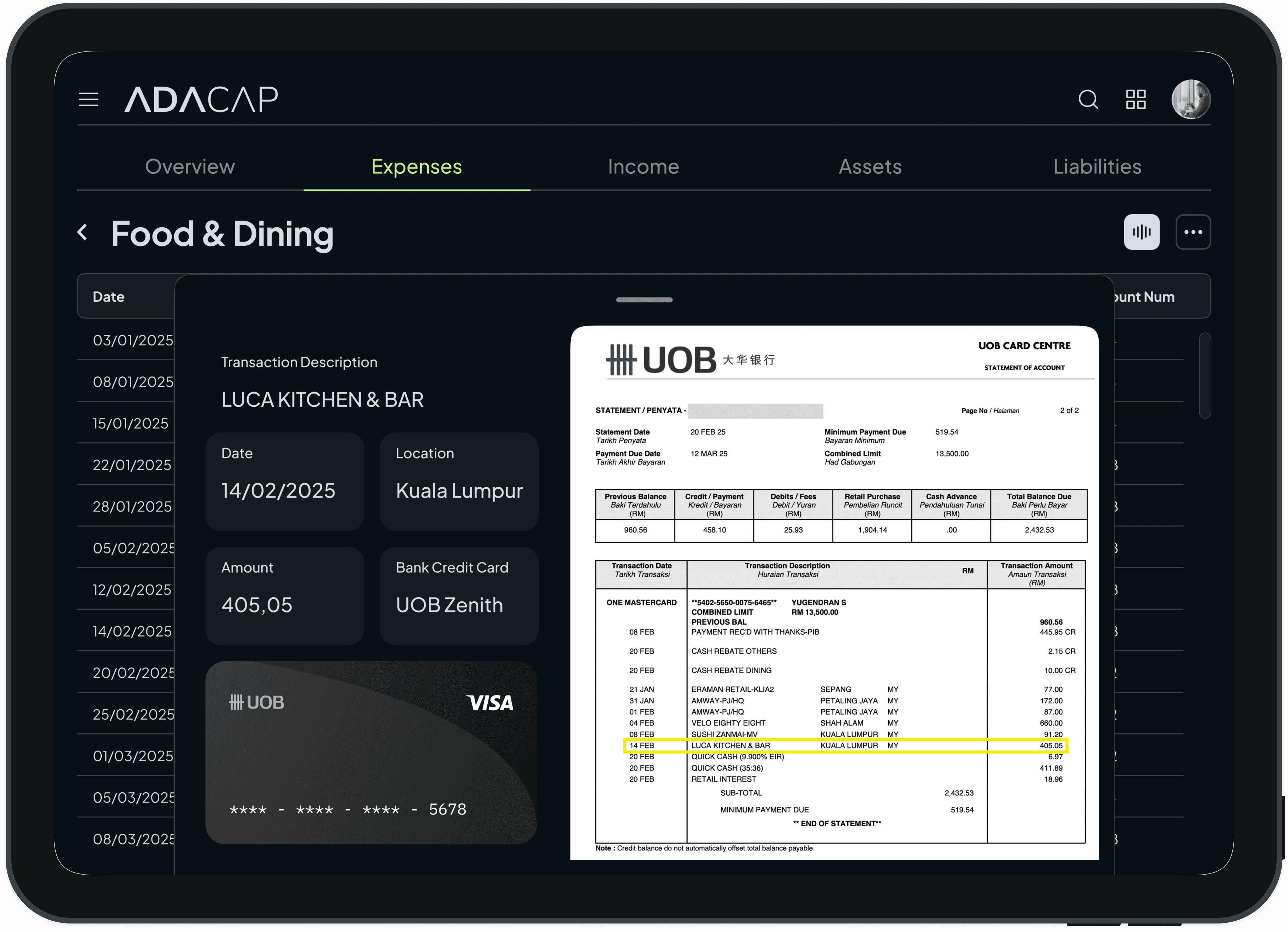
ADACAP Food and Dining transaction detail with UOB Visa card and matching UOB bank statement
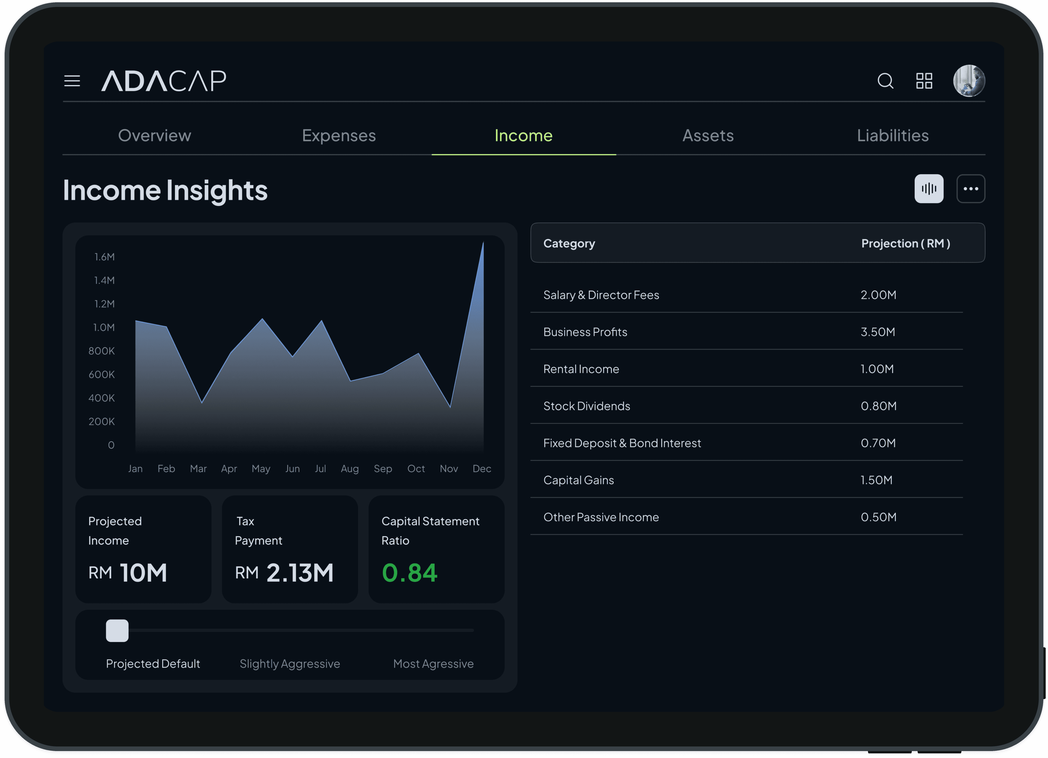
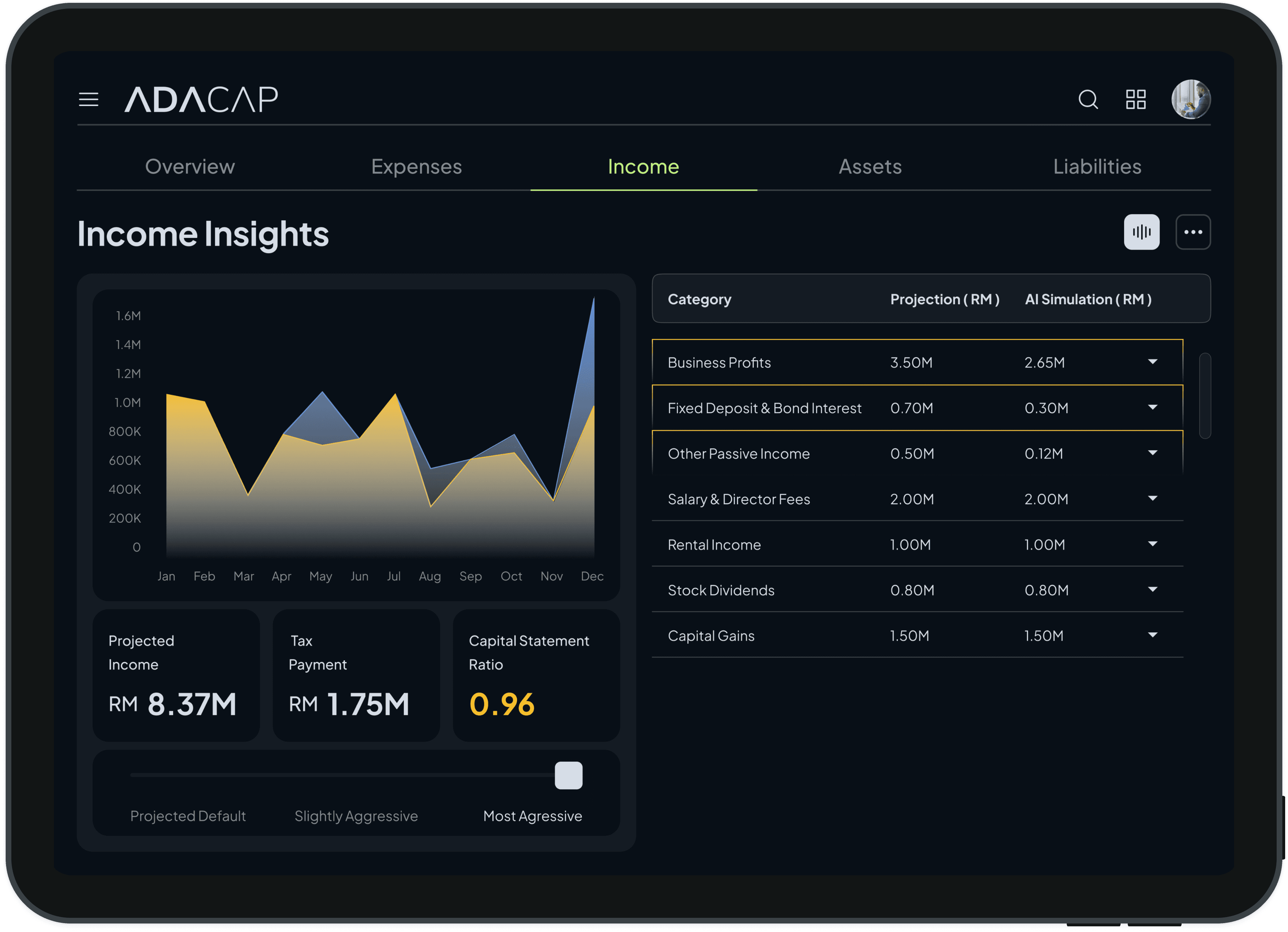
ADACAP Income Insights dashboard with monthly income area chart and income category projection table
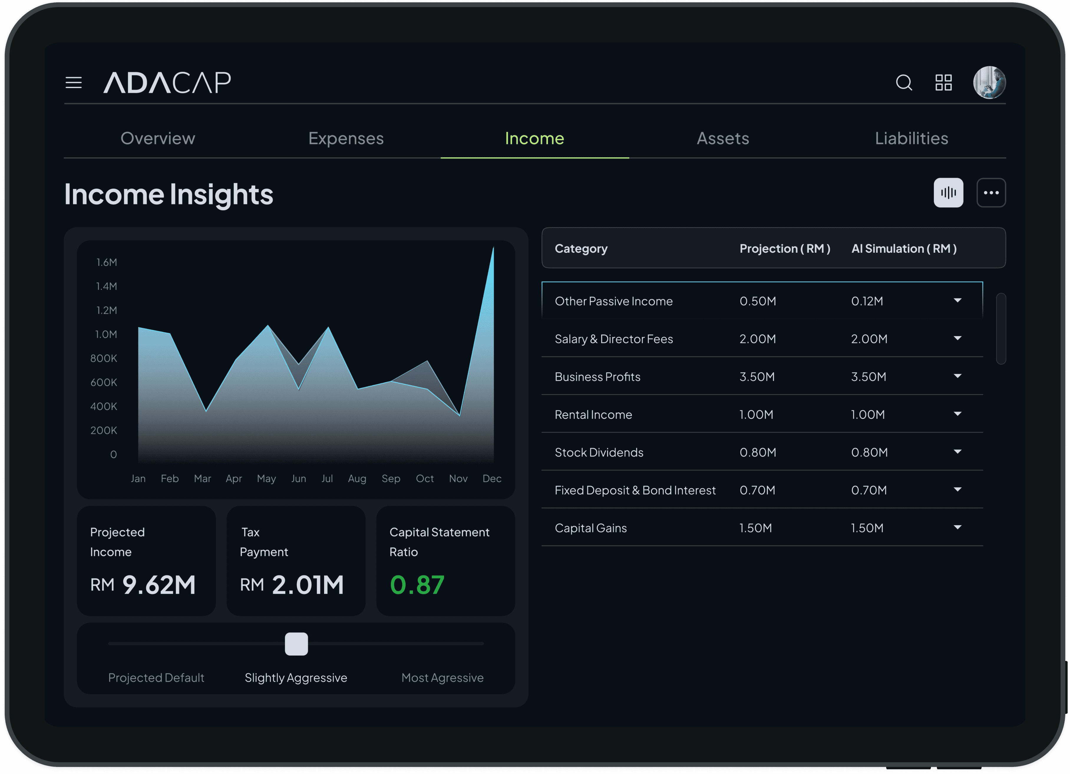
ADACAP finance app Income Insights tab: monthly income area chart and category table, projected income RM 9.62M
ADACAP Income Insights, Most Aggressive AI simulation: income chart and category table, projected income RM 8.37M
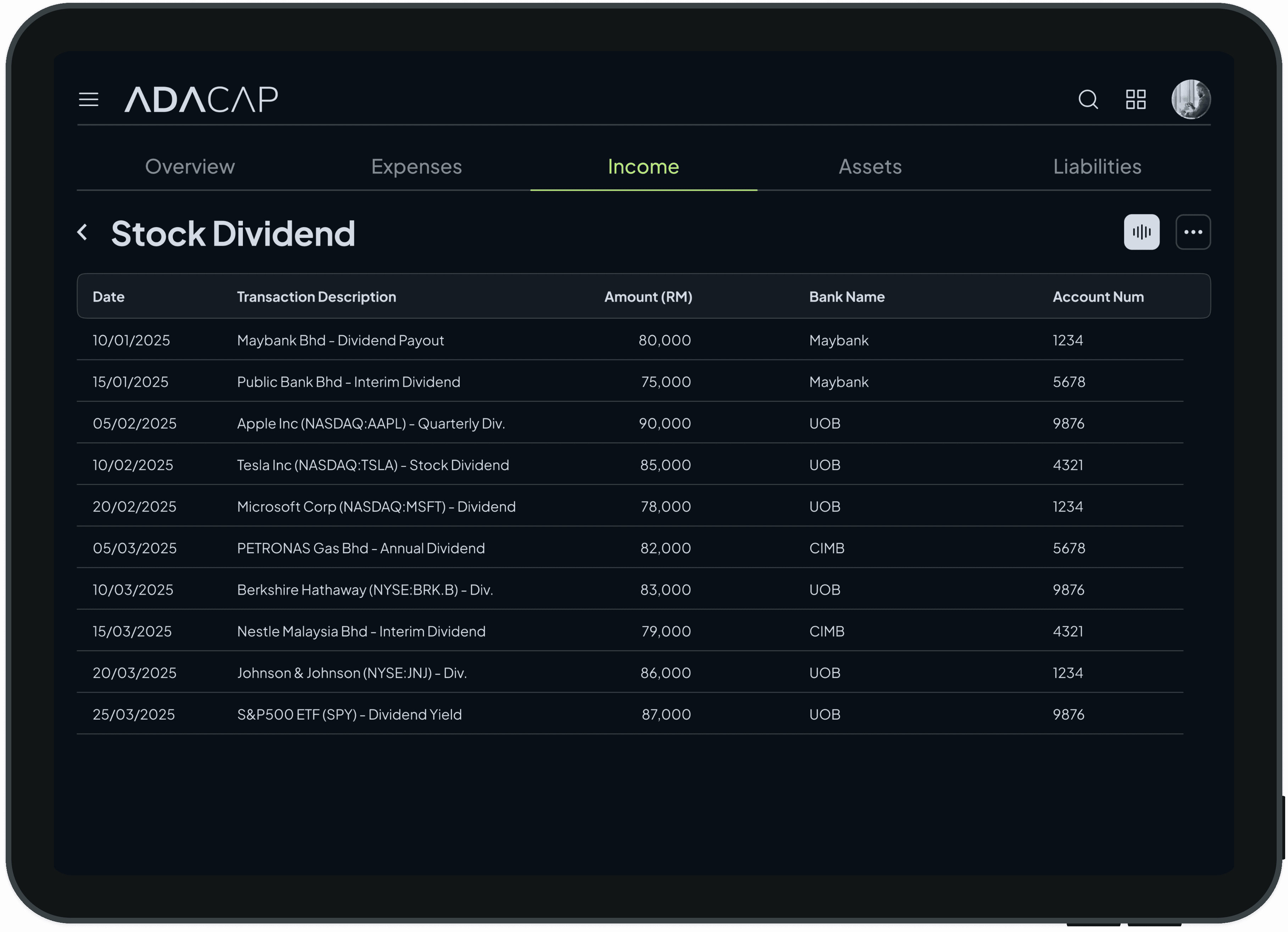
ADACAP Stock Dividend transactions table listing date, description, amount, bank name and account number
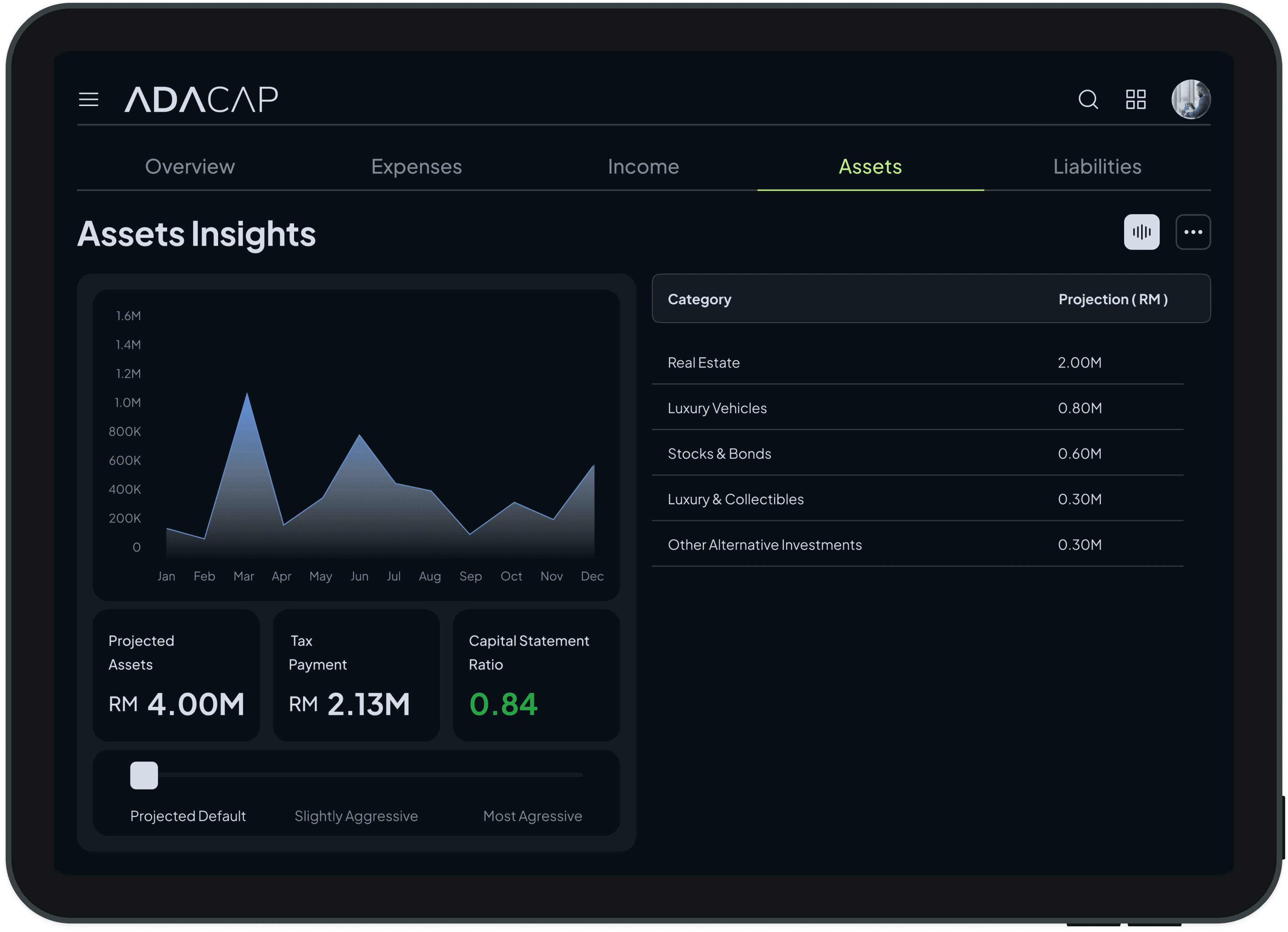
ADACAP Assets Insights tab: monthly assets area chart and asset category table, projected assets RM 4.00M
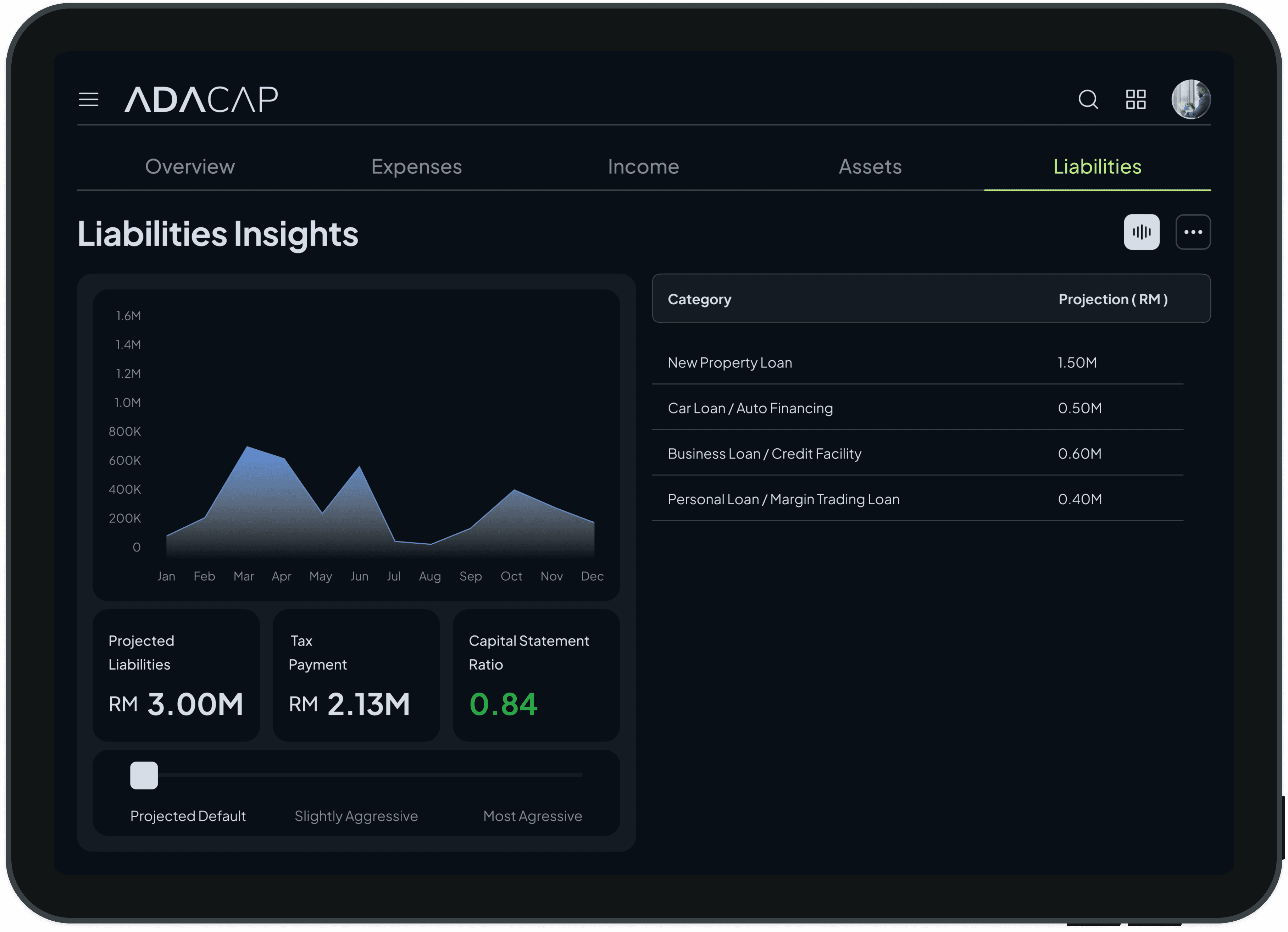
ADACAP Liabilities Insights tab: monthly liabilities area chart and loan category table, projected liabilities RM 3.00M
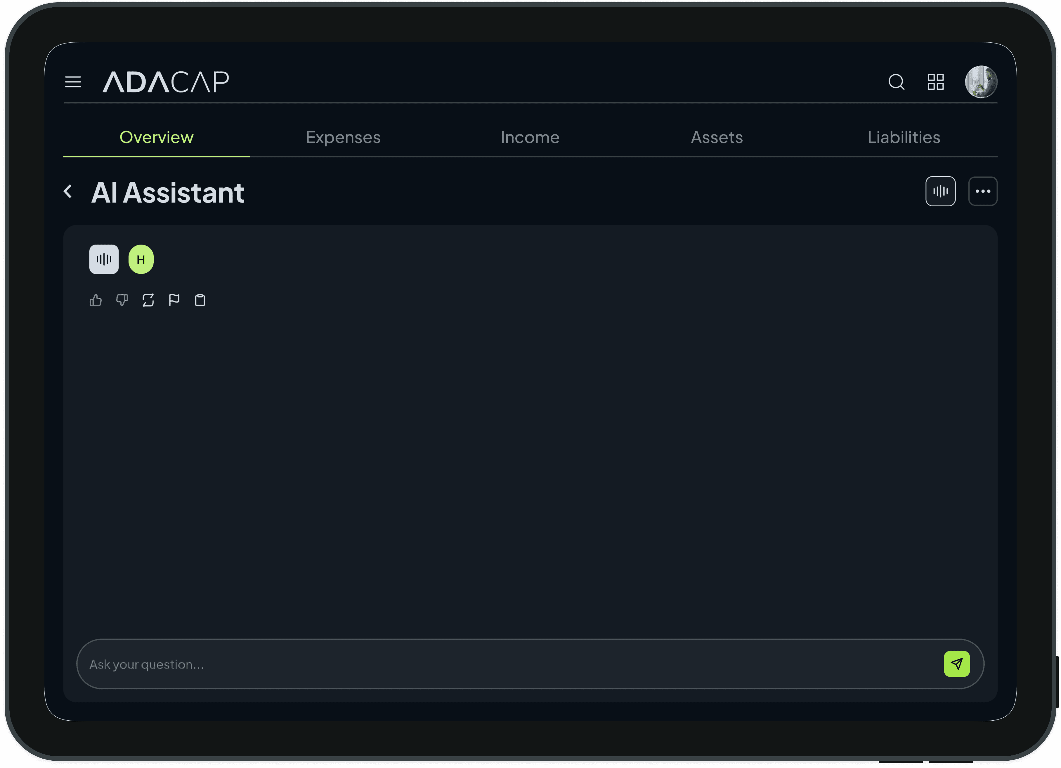
ADACAP AI Assistant chat screen with an empty conversation and Ask your question input field

Outcome

What shipped. ADACAP shipped as a complete, responsive high-fidelity design backed by a documented design system — tokens, components and defined states, ready for engineering handoff. What had been scattered across separate bank apps and spreadsheets became one authoritative view of income, expenses, assets, liabilities and tax.

  • Fragmentation → one view — a top-down overview with drill-down into the transactions behind every figure gives users like Daniel a single source of truth instead of five separate apps.

  • Clarity → one visual system — income, expenses, assets, liabilities and tax share a consistent visualization language, so the real impact of spending reads at a glance.

  • Trust → reconciliation by design — statement views are structured to be checked directly against bank records, cutting the manual matching that made users doubt their numbers.

  • Records → decisions — projections, capital ratio and exemption breakdowns turn transaction history into forward-looking guidance no bank app offered.

Testing & iteration. Usability sessions focused on comprehension and on how easily people moved from summary figures to the underlying detail; that feedback shaped the dashboard hierarchy, chart legibility and labelling in the final design.

Reflection. The hardest part of a finance product is earning trust in the numbers — the thing most worth validating and hardest to prove at handoff. Taken further, I’d instrument reconciliation completion and time-on-task, pressure-test the forecasting views with real multi-account data, and keep the tax breakdowns current with Malaysian rules.