Elevating Hotel.com’s User Experience through Strategic Redesigns
Elevating Hotel.com’s User Experience through Strategic Redesigns
Industry
Industry
Industry
Hospitality
Hospitality
Hospitality
Client
Client
Client
Hotels.com
Hotels.com
Hotels.com
Service
Service
Service
UIUX Design
UIUX Design
UIUX Design
Date
Date
Date
2022
2022
2022
Overview
Overview
This project involved redesigning the Hotel.com Mobile App to improve the booking process and overall user experience for travelers. The goal was to create a more modern, intuitive, and visually appealing interface.
This project involved redesigning the Hotel.com Mobile App to improve the booking process and overall user experience for travelers. The goal was to create a more modern, intuitive, and visually appealing interface.
This project involved redesigning the Hotel.com Mobile App to improve the booking process and overall user experience for travelers. The goal was to create a more modern, intuitive, and visually appealing interface.
Challenges
Challenges
Complexity in Navigation: The old design made it difficult for users to find key functions like search, booking, and profile management.
Cluttered Layout: The interface was cluttered, making it hard for users to focus on important actions.
Outdated Visuals: The UI design did not reflect modern design trends, making the app feel outdated.
Booking Flow Confusion: Users often faced confusion during the checkout process, especially in understanding fees and booking conditions.
Research & Discovery
Research & Discovery
User Research: Usability tests and surveys showed that users wanted a simplified experience with fewer steps, larger visuals of hotels, and clearer booking details.
Competitive Analysis: Competitor apps such as Airbnb and Booking.com offered more modern UIs with simplified booking processes and prominent visual hierarchy, which influenced the redesign decisions.
Design Objective
Design Objective
Streamline Navigation: Make it easier for users to explore, search, and book hotels without any confusion.
Modern UI and Visual Hierarchy: Implement a modern design with clear, bold typography, consistent visual elements, and a focus on imagery.
Clear Booking Process: Simplify the checkout flow by providing clear steps and upfront pricing information.
Enhanced Personalization: Integrate personalized hotel recommendations based on past searches and user preferences.
The Redesign Process
The Redesign Process
Wireframes and Prototypes: Early sketches focused on cleaning up the booking flow and highlighting essential features like search, pricing, and booking details. Prototypes tested the smooth transition between screens and easy access to the booking button.
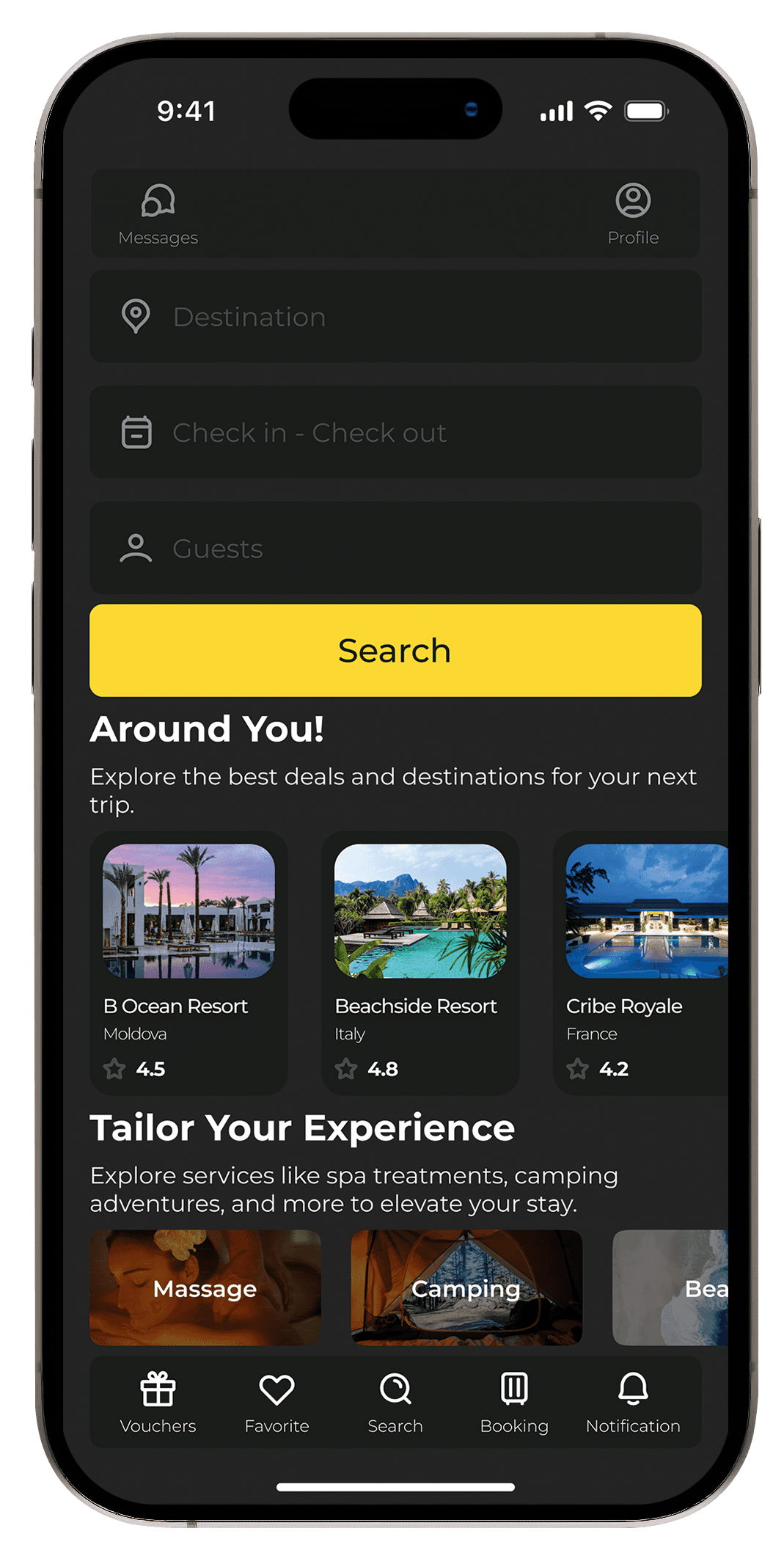
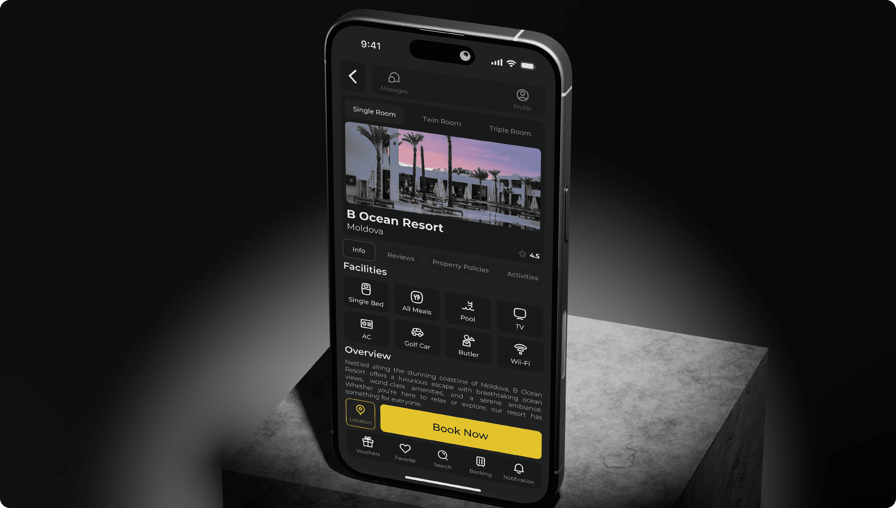
Streamlined Navigation Bar: The bottom navigation bar was updated to include quick access to Vouchers, Favorites, Search, Booking, and Notifications, making the app more intuitive.
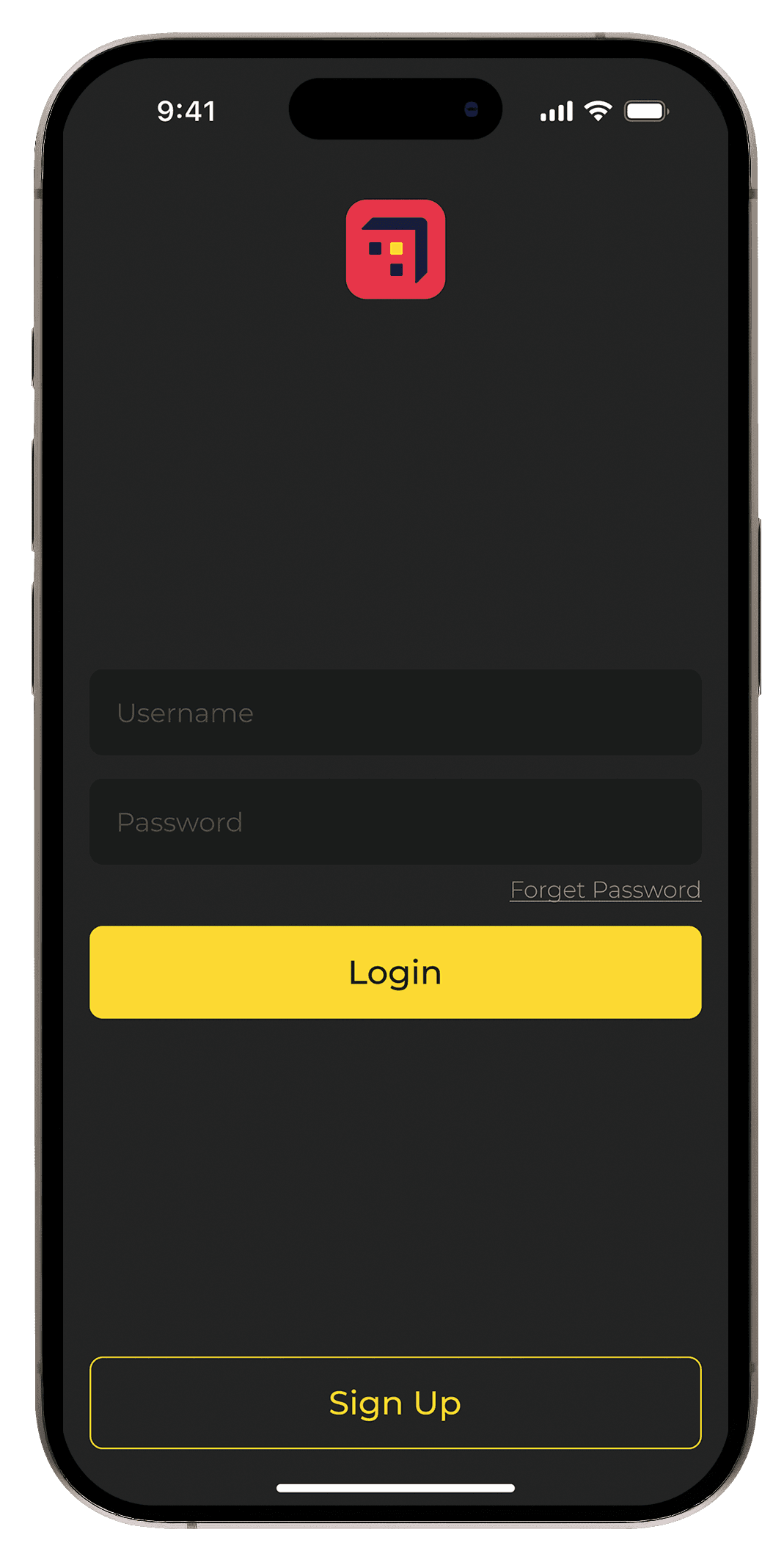
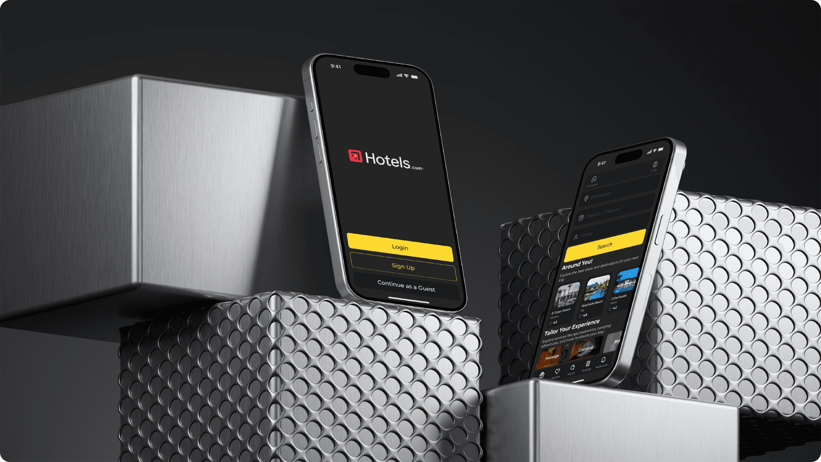
Bold Color Contrast: The redesign features a dark background with bright yellow call-to-action buttons for a modern look and better visibility.
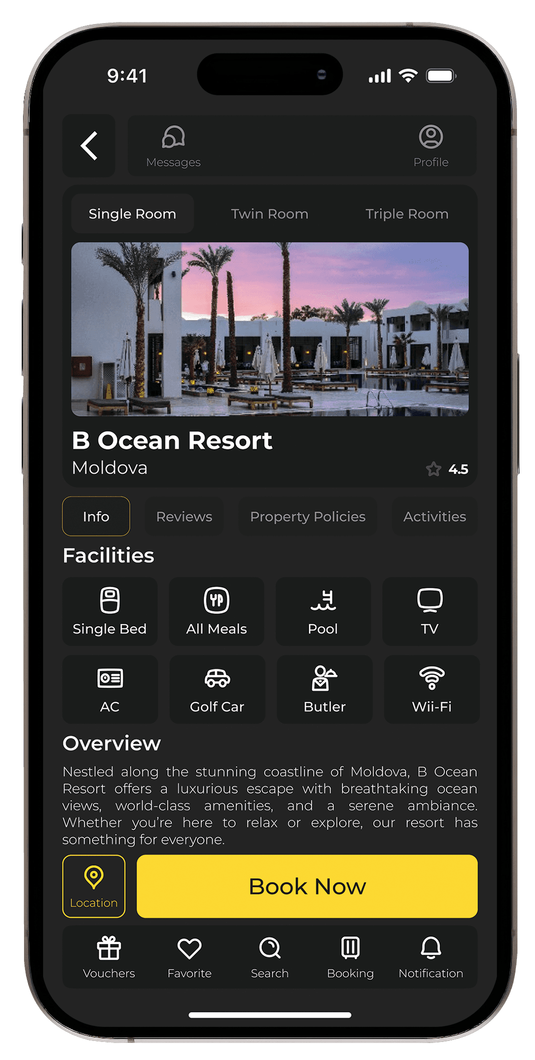
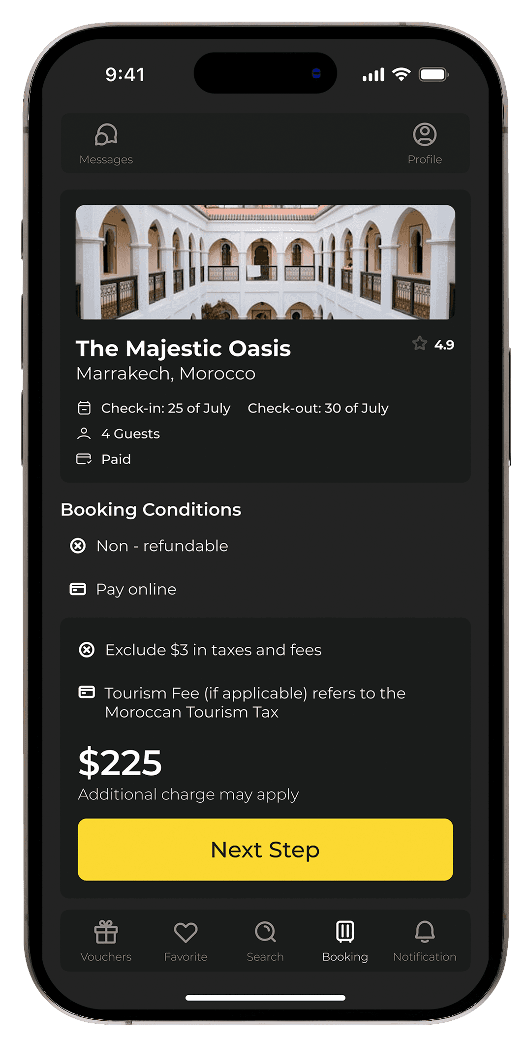
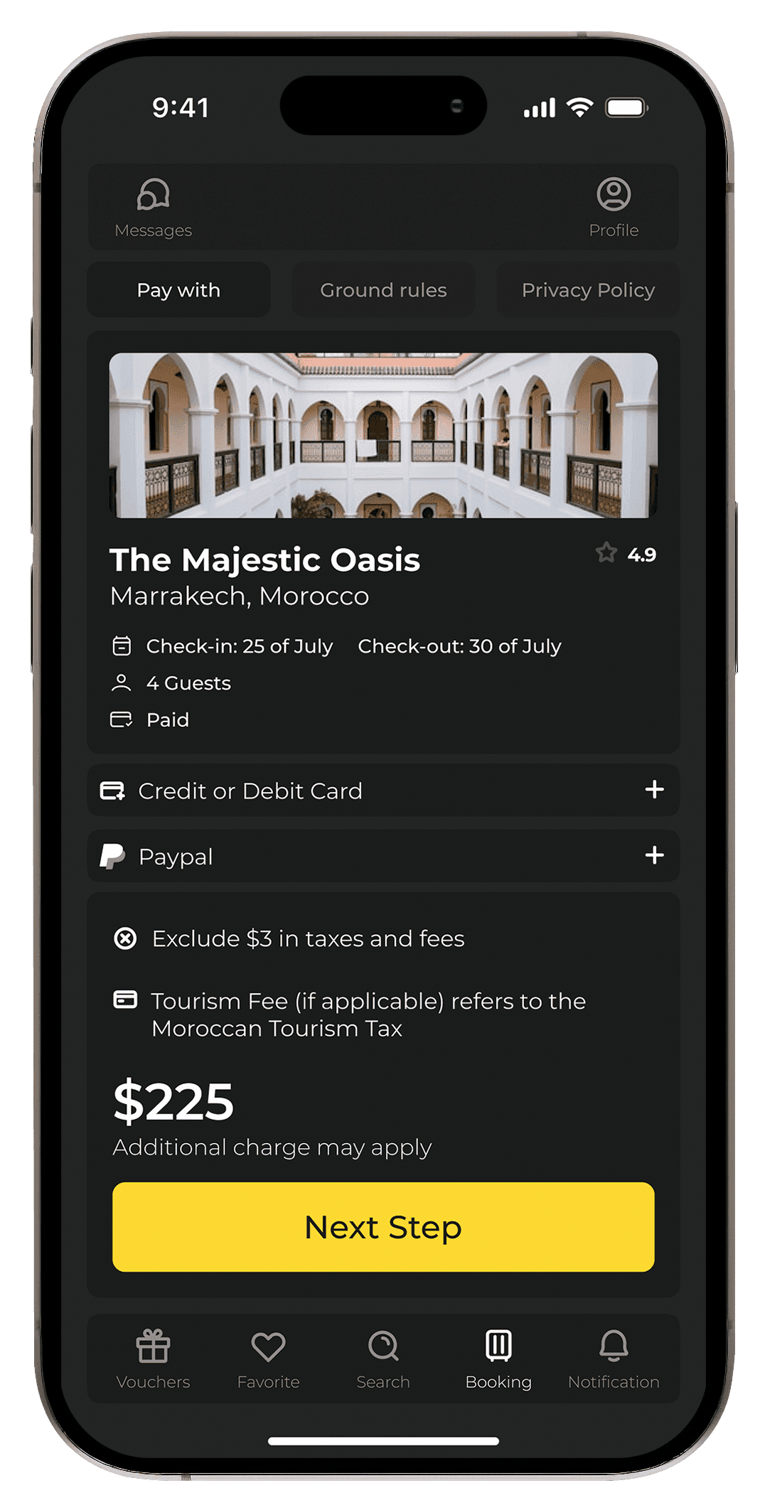
Clear Pricing and Booking Conditions: The pricing section was redesigned to include clear information on additional fees and booking conditions, avoiding surprises for users.
Tools Used: Figma was used to create high-fidelity mockups, allowing easy collaboration with stakeholders and developers.
Wireframes and Prototypes: Early sketches focused on cleaning up the booking flow and highlighting essential features like search, pricing, and booking details. Prototypes tested the smooth transition between screens and easy access to the booking button.
Streamlined Navigation Bar: The bottom navigation bar was updated to include quick access to Vouchers, Favorites, Search, Booking, and Notifications, making the app more intuitive.
Bold Color Contrast: The redesign features a dark background with bright yellow call-to-action buttons for a modern look and better visibility.
Clear Pricing and Booking Conditions: The pricing section was redesigned to include clear information on additional fees and booking conditions, avoiding surprises for users.
Tools Used: Figma was used to create high-fidelity mockups, allowing easy collaboration with stakeholders and developers.
Visual and Functional Improvements
Visual and Functional Improvements
UI/UX Enhancements:
UI/UX Enhancements:
Simplified Navigation: The redesigned bottom navigation bar makes it easy for users to switch between key areas of the app, improving overall usability.
Modern Visual Aesthetic: A dark theme with bright accents ensures a visually appealing design, while high-quality images of hotels offer an immersive experience.
Improved Booking Flow: A cleaner checkout process with clear pricing, booking conditions, and payment options streamlines the user journey.
Personalization: The home screen now features personalized hotel suggestions based on user preferences, offering tailored experiences.
Interaction Design: Smooth transitions and clear visual feedback were added when users move between screens, such as selecting hotels or completing a booking.
Impact and ResultsGoals
Impact and ResultsGoals
Metrics and KPIs: Following the redesign:
Metrics and KPIs: Following the redesign:
Increased User Engagement: Users spent more time exploring hotels due to the clean layout and visual appeal.
Reduced Drop-off Rate: Fewer users abandoned the booking process, thanks to the simplified checkout flow.
Higher User Satisfaction: Feedback indicated a much smoother and intuitive experience, with users praising the clear pricing information and modern design.
Client/Stakeholder Feedback:
Client/Stakeholder Feedback:
Stakeholders noted the alignment with current design trends and appreciated the improved user experience, particularly during the booking process.
Stakeholders noted the alignment with current design trends and appreciated the improved user experience, particularly during the booking process.
Stakeholders noted the alignment with current design trends and appreciated the improved user experience, particularly during the booking process.
Lessons Learned
Lessons Learned
Challenges Faced:Learned
Challenges Faced:Learned
One challenge was ensuring that the dark theme maintained sufficient contrast for readability, especially for users with visual impairments. Rigorous testing helped fine-tune the color palette for accessibility.
One challenge was ensuring that the dark theme maintained sufficient contrast for readability, especially for users with visual impairments. Rigorous testing helped fine-tune the color palette for accessibility.
One challenge was ensuring that the dark theme maintained sufficient contrast for readability, especially for users with visual impairments. Rigorous testing helped fine-tune the color palette for accessibility.
Future Improvements:
Future Improvements:
Future iterations could focus on adding features like voice search for hotel bookings and deeper integration with loyalty programs to increase user retention.
Future iterations could focus on adding features like voice search for hotel bookings and deeper integration with loyalty programs to increase user retention.
Future iterations could focus on adding features like voice search for hotel bookings and deeper integration with loyalty programs to increase user retention.
Final Presentation
Final Presentation
Before vs. After
Before vs. After
Side-by-side comparisons of the old and redesigned screens show a clear improvement in navigation, visual clarity, and the overall user experience.
Side-by-side comparisons of the old and redesigned screens show a clear improvement in navigation, visual clarity, and the overall user experience.
Side-by-side comparisons of the old and redesigned screens show a clear improvement in navigation, visual clarity, and the overall user experience.
Key Screens:
Key Screens:
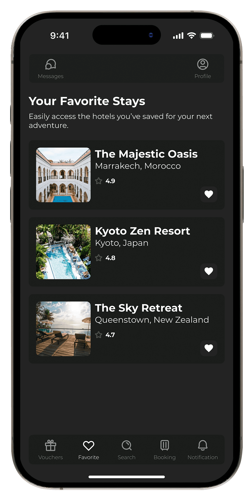
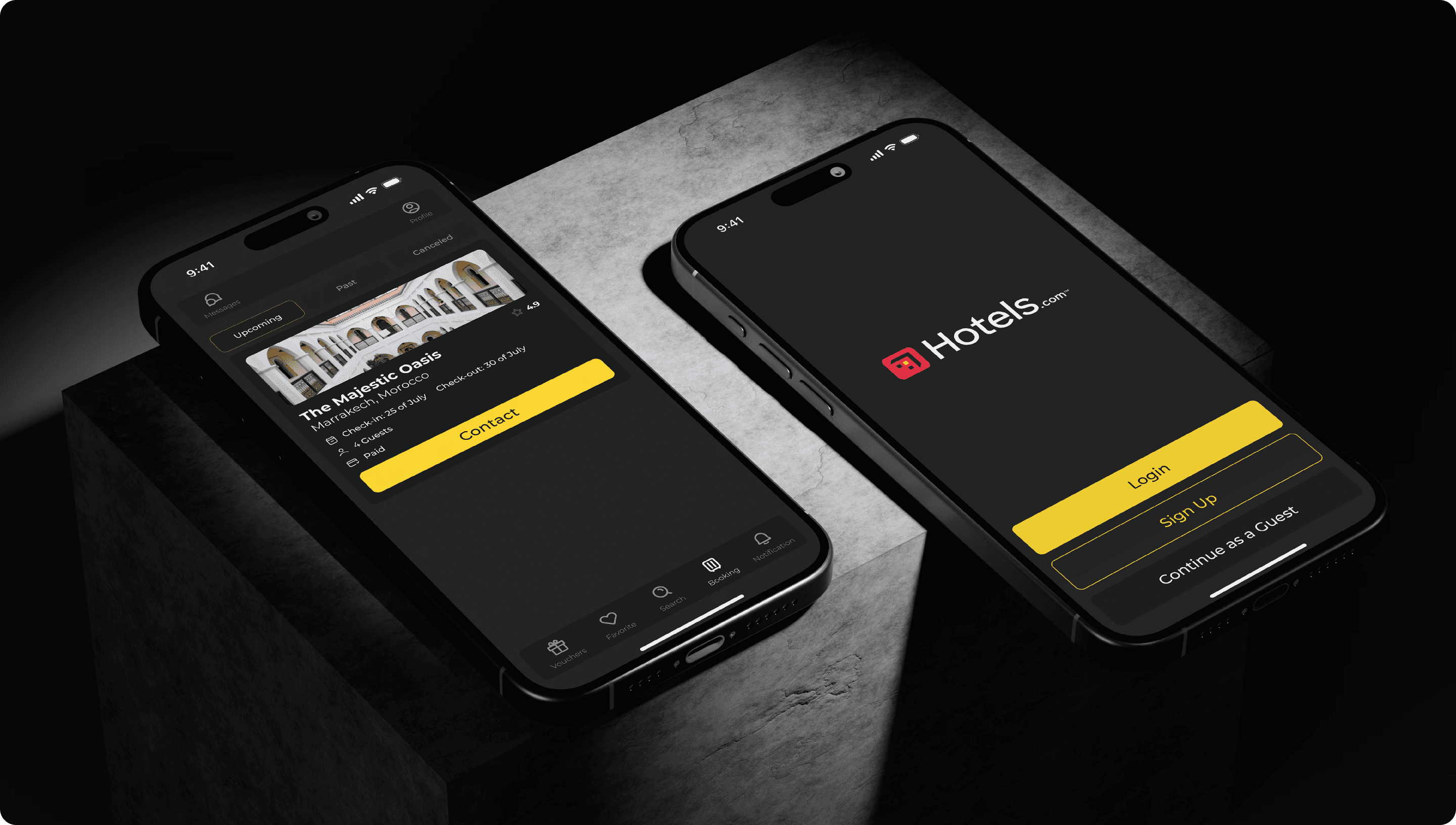
Home Screen: Showcasing personalized hotel recommendations and quick-access search.
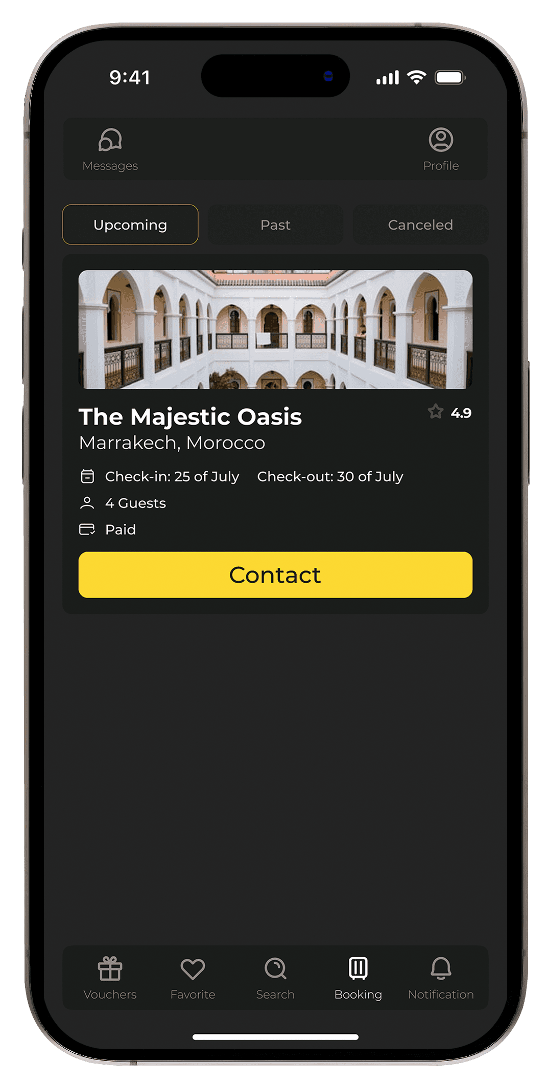
Hotel Details Screen: Featuring clear booking conditions, hotel facilities, and prominent visuals.
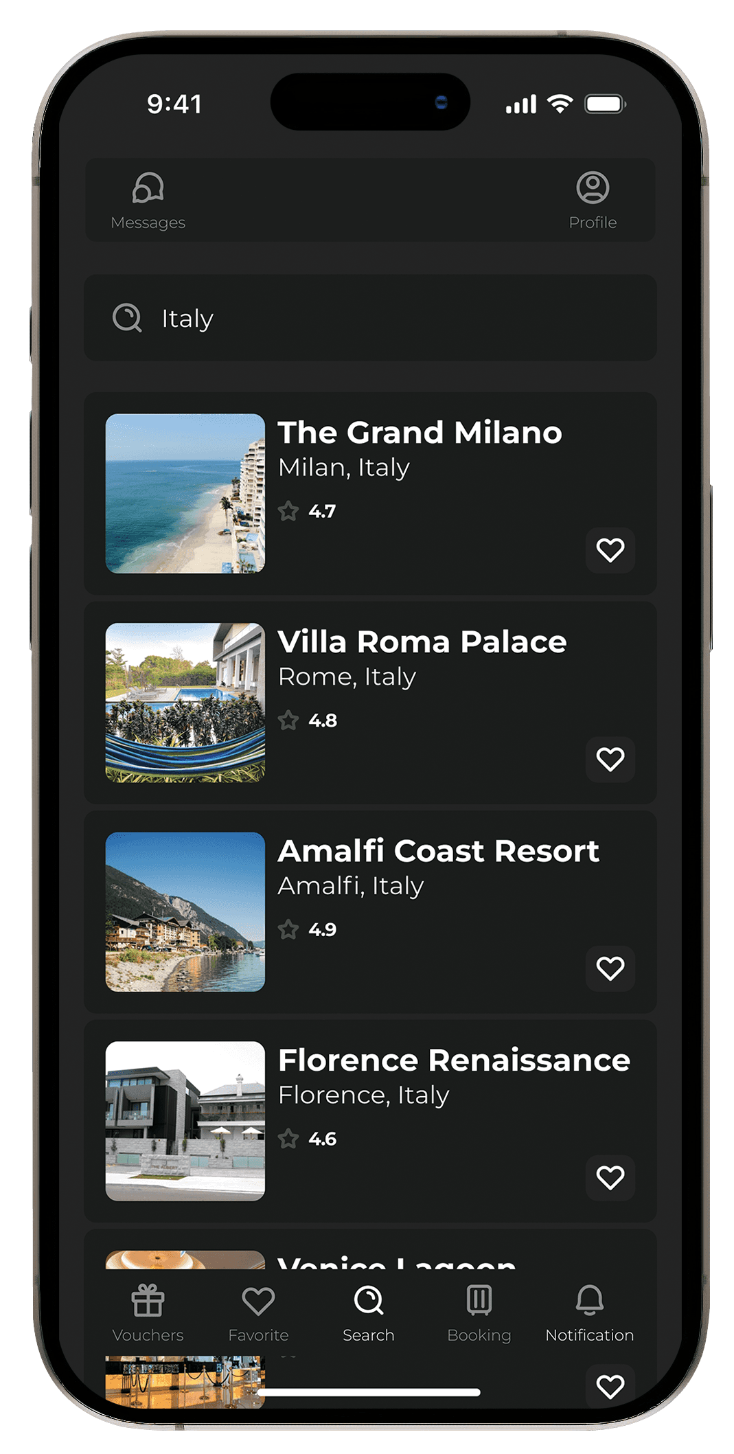
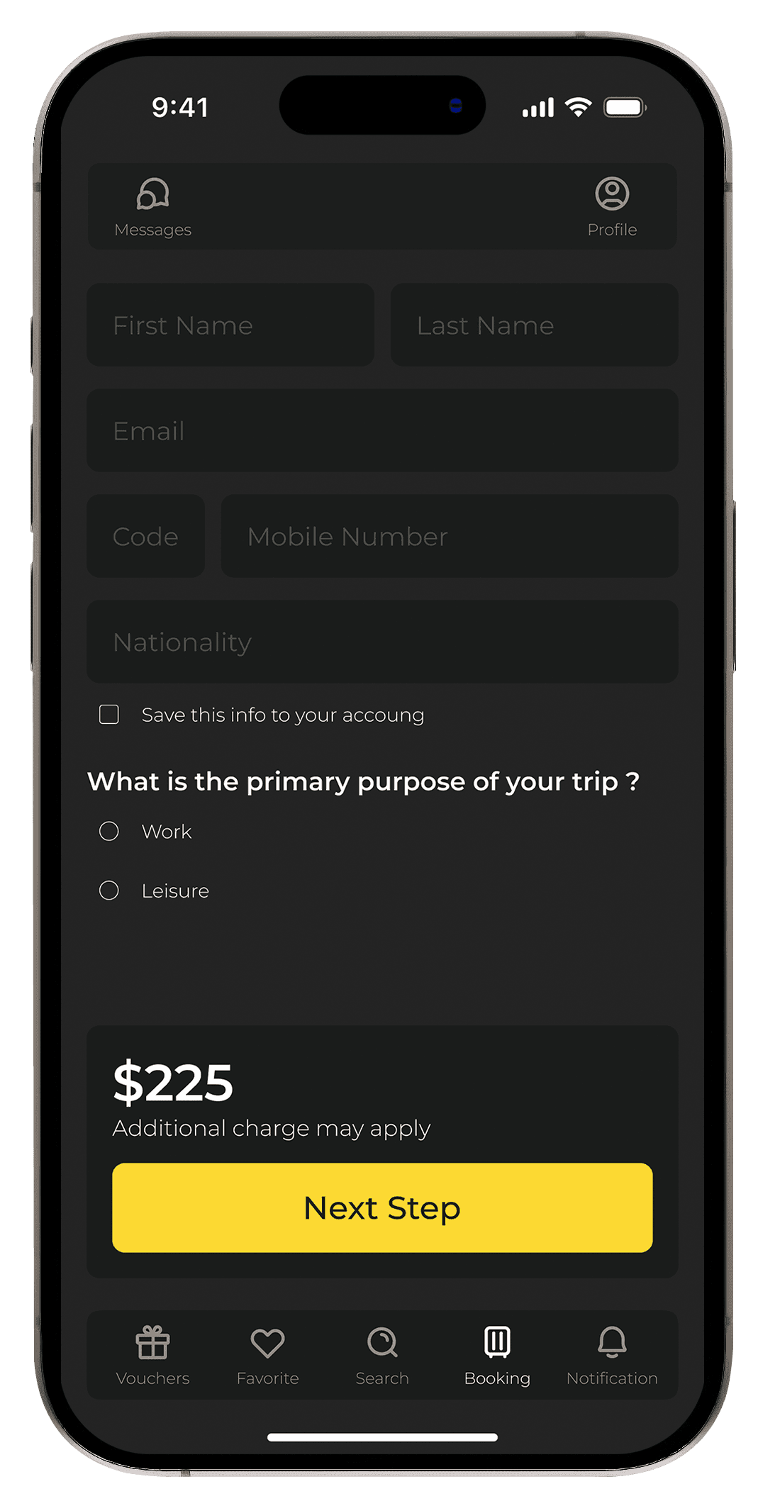
Booking Flow Screens: Simplified pricing details and clear action buttons for the next steps.
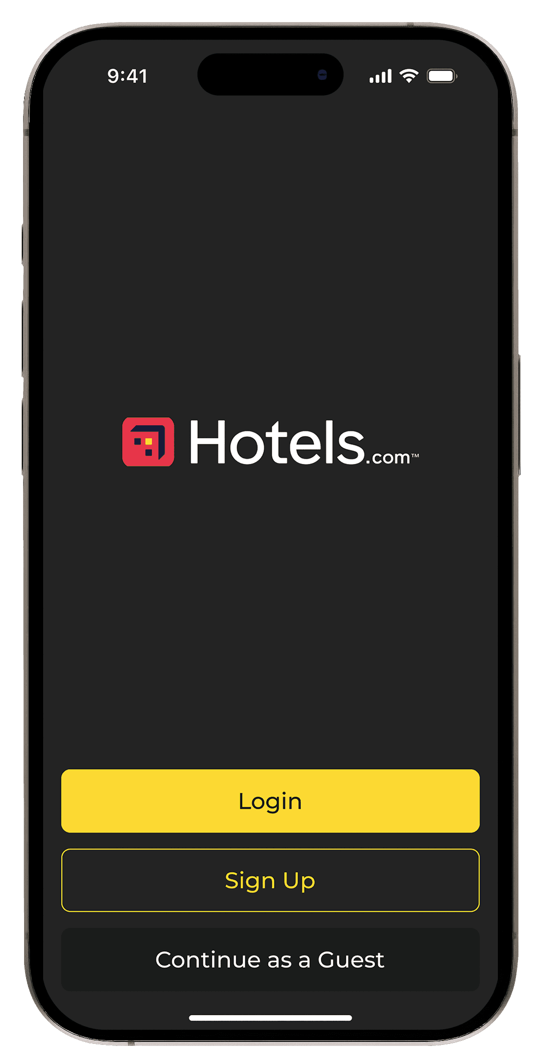
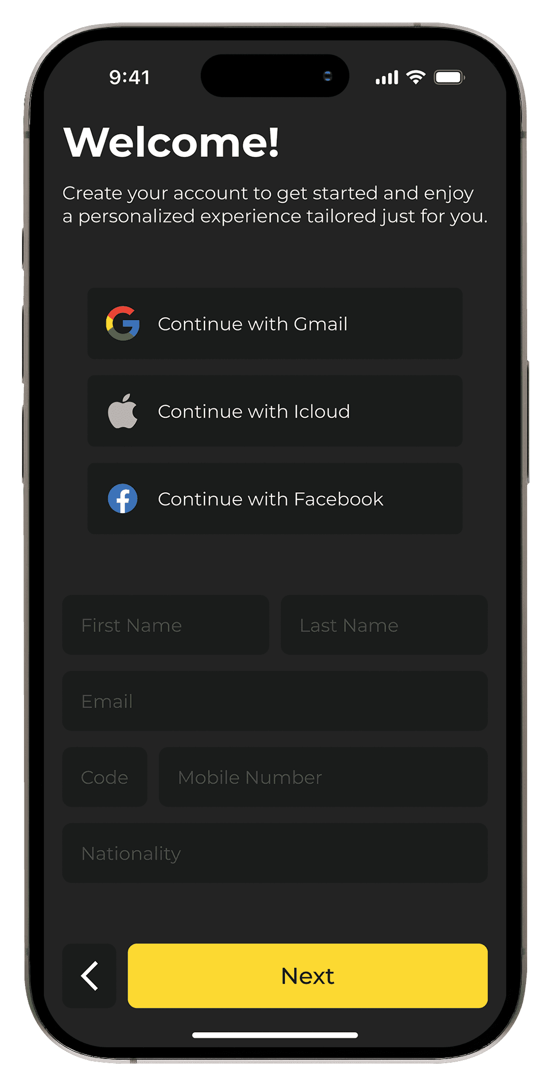
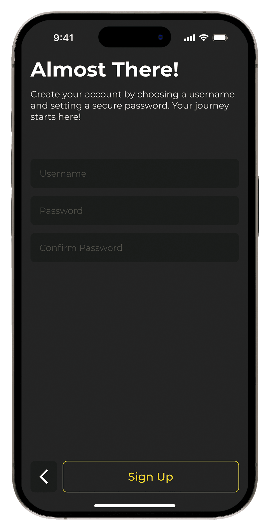
Login and Sign-Up Screen: A minimalistic, clean design to encourage user account creation or guest login.
Home Screen: Showcasing personalized hotel recommendations and quick-access search.
Hotel Details Screen: Featuring clear booking conditions, hotel facilities, and prominent visuals.
Booking Flow Screens: Simplified pricing details and clear action buttons for the next steps.
Login and Sign-Up Screen: A minimalistic, clean design to encourage user account creation or guest login.
Color Style
Color Style
BG Color
#242424
rgb(36, 36, 36)
hsl(0, 0, 14)
First BTN Color
#FCD931
rgb(252, 217, 49)
hsl(50, 97, 59)
Second BTN Color
#1A1C1B
rgb(26, 28, 27)
hsl(150, 4, 11)
Typography
Headline 1
Montserrat
Bold
36px
/
auto
The quick brown fox jumps over the lazy dog.
Paragraph
Montserrat
Regular
16px
/
auto
The quick brown fox jumps over the lazy dog.
Headline 2
Montserrat
Bold
22px
/
auto
The quick brown fox jumps over the lazy dog.
Paragraph 2
Montserrat
Regular
14px
/
auto
The quick brown fox jumps over the lazy dog.
Headline 3
Montserrat
SemiBold
18px
/
auto
The quick brown fox jumps over the lazy dog.
H Card
Montserrat
Bold
20px
/
auto
The quick brown fox jumps over the lazy dog.
S Card
Montserrat
Medium
12px
/
auto
The quick brown fox jumps over the lazy dog.
Icon Text
Montserrat
Light
10px
/
auto
The quick brown fox jumps over the lazy dog.
BTN Text
Montserrat
Medium
20px
/
auto
The quick brown fox jumps over the lazy dog.
Rate Text
Montserrat
Bold
12px
/
17px
The quick brown fox jumps over the lazy dog.
High Fi
High Fi